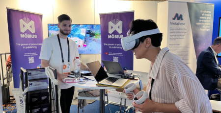
Engaging users in the development of Möbius: How did users evaluate the Möbius Prosumer Intelligence Toolkit in pilot phase 2?
The Prosumer Intelligence Toolkit (PIT) is a data dashboard for publishers that presents insights by collecting knowledge and data from prosumer online fandom communities (e.g., Archive of Our Own). To test the dashboard, we used a qualitative approach called ‘think aloud sessions’. Concretely, between June 2022 and September 2022, we asked 30 publishers to voice their experience and opinion while they were testing the first PIT mock-up. During the brief follow-up interview, the publishers could express their feedback and opinions. Below we summarise the main findings.
Dashboard
The feedback given regarding the dashboard (home page) of the PIT was mainly about how there was confusion about how to interpret “Total Posts”, “Total Books” and “Total Authors” (see image). These appellations were displayed in the dashboard with each having a given number that indicated how many posts, books and authors had been collected within the PIT. As a solution, there should be more indicators or a tutorial which explains the data collection, aggregation, and presentation.

Popular books
The section of ‘Popular Books’ did raise numerous questions. The section doesn’t define where the results were collected from, and how the different icons and numbers should be interpreted. Therefore, a function with additional information could be an ideal feature to clarify the section. Also, the section could be used to perform competitive analysis between different books, from different publishers.
Tabs
The authors tab, books tab and posts tab received overall similar feedback. There was some confusion about the different graphs, how/where the data was collected, and on what data the graphs are based on. Furthermore, the graphs do have certain gaps regarding the keywords that weren’t real keywords, the X/Y axis in the timeline doesn’t have clarification, etc. Hereby, the participants didn’t fully understand the purpose of the different tabs. This due to the limitations of the PITs’ first mock-up.
Overall user experience
Publishers were optimistic and interested in the application. First, the PIT opens new streams of data, hereby, presenting new insights regarding what’s happening online. Second, the easy visualisation of the data made the PIT appealing. Third, overall the application is simple and inviting to use, which is a good sign. Still, not only positive feedback was given, we received plenty of feedback regarding missing features and unclear technicalities of the dashboard.
As for this blog post we can conclude that the PIT generates interest and invites usage. However, there is still confusion on the interpretation of some features. We would like to solve this in the next versions of the PIT by integrating more indicators and or tutorials. Stay tuned for future blog posts and updates on the Möbius project!


